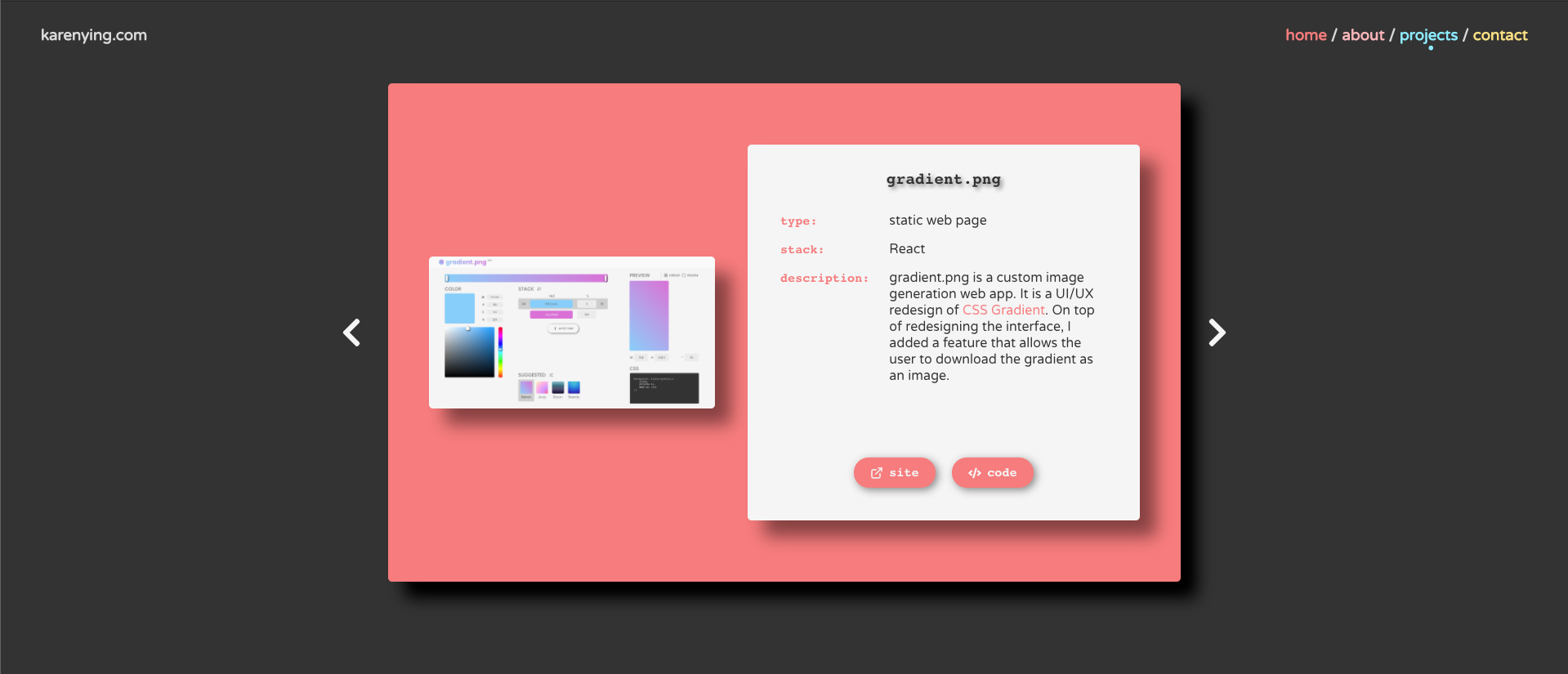
 Carousel on my personal site
Interested in jazzing up a boring React carousel? In this post, we use Material-UI, an insanely popular and easy-to-use React library, to add sliding transitions.
Bonus: stick around to see how to implement arrow-key navigation controls.
If you are only interested in the transitions, skip ahead to step 4, else we’re coding this carousel from scratch. There are already a bunch of npm packages for React carousels, but implementing it ourselves gives us more customization flexibility. It’s also fun and pretty simple!
The GitHub repo for all the code below can be found here. See the deployed version here.
Prereqs
This tutorial assumes you have some knowledge of React, function components, and hooks. All good? Let’s get started 👍🏼
Implementation
0. Getting set up
We’ll use Create React App to create, bundle, and run the project:
$ npx create-react-app react-carousel
$ cd react-carousel
$ npm start
…and add some dependencies — Material-UI for the transitions, and React Icons for the cute arrows:
$ npm install @material-ui/core
$ npm install react-icons
Before we start creating components, we need to update App.css to use CSS Flexbox to format our page:
| .App { | |
| text-align: center; | |
| padding: 100px; | |
| display: flex; | |
| justify-content: center; | |
| align-items: center; | |
| } |
Yay let’s write some React components!
1. Setting up slide component
In a new file, CarouselSlide.js, we’re going to create our slide component which takes in a single prop, content.
content will be a JS object with the properties backgroundColor, and title which will determine the background color and the title of the current slide respectively (obviously 😛).
We’re also using Material-UI’s Card component and makeStyles hook to style the slide. More info on Material-UI custom styling can be found here.
Here’s the code for CarouselSlide.js:
| import React from 'react'; | |
| import { Card, makeStyles } from '@material-ui/core'; | |
| export default function CarouselSlide(props) { | |
| const { backgroundColor, title } = props.content; | |
| const useStyles = makeStyles(() => ({ | |
| card: { | |
| backgroundColor, | |
| borderRadius: 5, | |
| padding: '75px 50px', | |
| margin: '0px 25px', | |
| width: '500px', | |
| boxShadow: '20px 20px 20px black', | |
| display: 'flex', | |
| justifyContent: 'center', | |
| } | |
| })); | |
| const classes = useStyles(); | |
| return ( | |
| <Card className={classes.card}> | |
| <h1>{title}</h1> | |
| </Card> | |
| ); | |
| } |
To get the slide to render, we’ll create some props for content and update App.js:
| import React from 'react'; | |
| import './App.css'; | |
| import CarouselSlide from './CarouselSlide'; | |
| function App() { | |
| return ( | |
| <div className='App'> | |
| <CarouselSlide | |
| content={{ backgroundColor: '#ff7c7c', title: 'Slide 1' }} | |
| /> | |
| </div> | |
| ); | |
| } | |
| export default App; |
Okay! After running npm start, we should see something like this on http://localhost:3000/:
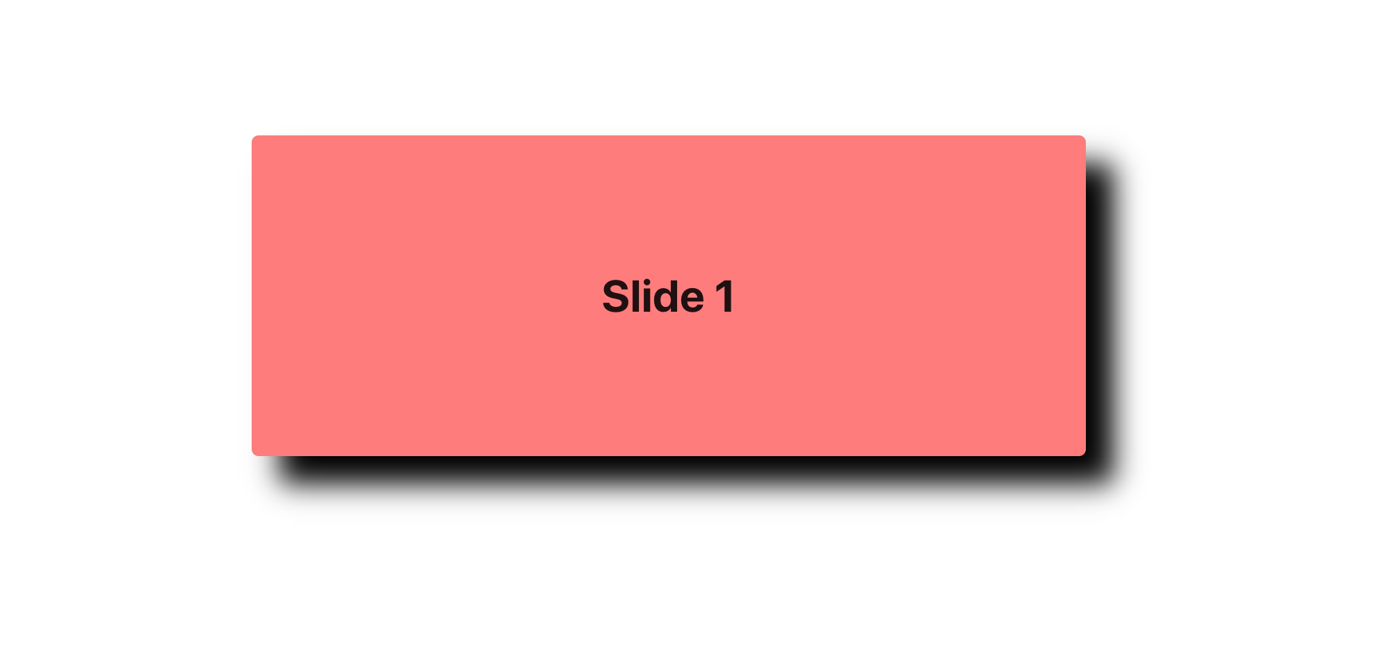
Super super simple. Now let’s add some more content to iterate through in our carousel.
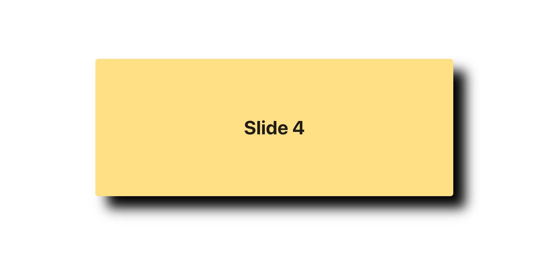
2. Generating slide content
We’re gonna put all our slide info in a new file called constants.js. It’ll take the shape of an array of objects that have the same structure as the content prop we worked with above:
| export const SLIDE_INFO = [ | |
| { backgroundColor: '#ff7c7c', title: 'Slide 1' }, | |
| { backgroundColor: '#ffb6b9', title: 'Slide 2' }, | |
| { backgroundColor: '#8deaff', title: 'Slide 3' }, | |
| { backgroundColor: '#ffe084', title: 'Slide 4' }, | |
| { backgroundColor: '#d9d9d9', title: 'Slide 5' }, | |
| ]; |
With constants.js, we can refactor App.js to import and index into SLIDE_INFO:
| import React from 'react'; | |
| import './App.css'; | |
| import CarouselSlide from './CarouselSlide'; | |
| import { SLIDE_INFO } from './constants'; | |
| function App() { | |
| const content = SLIDE_INFO[3]; | |
| return ( | |
| <div className='App'> | |
| <CarouselSlide content={content} /> | |
| </div> | |
| ); | |
| } | |
| export default App; |
Since we indexed into the 4th item, the rendered slide should be yellow with the title “Slide 4”:
3. Changing content on click with arrows
Time to add some arrows.
We’re just gonna create a super simple Arrow function component that takes in a direction and click function. We’ll use some arrow SVGs from React-Icon. Adding it to App.js:
| import { FaChevronLeft, FaChevronRight } from 'react-icons/fa'; | |
| function Arrow(props) { | |
| const { direction, clickFunction } = props; | |
| const icon = direction === 'left' ? <FaChevronLeft /> : <FaChevronRight />; | |
| return <div onClick={clickFunction}>{icon}</div>; | |
| } |
Next, we need to implement the click handler.
We’ll use the useState hook to keep track of which slide we’re currently on with the state variable index. Then we use this state variable to index into SLIDE_INFO.
The right and left click handlers need to increment and decrement index respectively to change the currently rendered slide.
Instead of handling the two directions separately, like the Arrow component above, we’ll combine the logic in one function called onArrowClick.
onArrowClick takes in a direction and updates index appropriately:
| const [index, setIndex] = useState(0); | |
| const content = SLIDE_INFO[index]; | |
| const numSlides = SLIDE_INFO.length; | |
| const onArrowClick = (direction) => { | |
| const increment = direction === 'left' ? -1 : 1; | |
| const newIndex = (index + increment + numSlides) % numSlides; | |
| setIndex(newIndex); | |
| }; |
Note: in line 7 above, we add numSlides to the sum of index and increment, and mod it by numSlides. This ensures that we always be within the range of 0 and numSlides — 1 to stay in bounds.
Finally, we update the return statement of App.js to render the arrows:
| return ( | |
| <div className='App'> | |
| <Arrow | |
| direction='left' | |
| clickFunction={() => onArrowClick('left')} | |
| /> | |
| <CarouselSlide content={content} /> | |
| <Arrow | |
| direction='right' | |
| clickFunction={() => onArrowClick('right')} | |
| /> | |
| </div> | |
| ); |
and style the arrow SVGs in App.css:
| svg { | |
| height: 30px; | |
| cursor: pointer; | |
| } |
After this step, we have a working carousel:
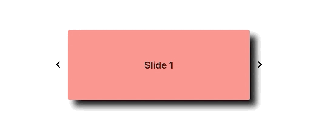
…but it looks awfully plain 😞 Let’s add some transitions!
4. Adding transitions with Material-UI
The transition we’re using is Material-UI’s Slide API. We’ll have to create two new state variables: slideIn, and slideDirection to correspond with Slide’s in and direction props respectively.
in dictates when the component appears if true, and when the component exits if false.
direction dictates where the component enters from. This means that without changing direction, the component enters and exits from the same direction. This is not the desired effect we want for a carousel! The slides must enter and exit from opposite directions to give the appearance of moving left or right across the page. Thus, we need to change direction in between setting in from false to true.
We also need to use setTimeout so that the previous slide has time to exit before the next slide enters.
After updating slideIn and slideDirection in onArrowClick, we’ve added:
| const [slideIn, setSlideIn] = useState(true); | |
| const [slideDirection, setSlideDirection] = useState('down'); | |
| const onArrowClick = (direction) => { | |
| const increment = direction === 'left' ? -1 : 1; | |
| const newIndex = (index + increment + numSlides) % numSlides; | |
| const oppDirection = direction === 'left' ? 'right' : 'left'; | |
| setSlideDirection(direction); | |
| setSlideIn(false); | |
| setTimeout(() => { | |
| setIndex(newIndex); | |
| setSlideDirection(oppDirection); | |
| setSlideIn(true); | |
| }, 500); | |
| }; |
Note: in line 2, we set the initial value of slideDirection to 'down' so the carousel slides down on the first render.
Finally, we want to wrap our CarouselSlide component with an extra div since Material-UI’s Slide’s child ”needs to be able to hold a ref.” Then we pass in our state variables into Slide and our updated return statement now looks like:
| return ( | |
| <div className='App'> | |
| <Arrow | |
| direction='left' | |
| clickFunction={() => onArrowClick('left')} | |
| /> | |
| <Slide in={slideIn} direction={slideDirection}> | |
| <div> | |
| <CarouselSlide content={content} /> | |
| </div> | |
| </Slide> | |
| <Arrow | |
| direction='right' | |
| clickFunction={() => onArrowClick('right')} | |
| /> | |
| </div> | |
| ); |
Yay 🎉
We got the slide transitions to work. This is what the carousel should look like now:

If you think the transitions are too fast, you can use the timeout prop from the Slide API and adjust it to your speed.
Anyways, it looks great 😅 Good job!
But how nice would it be if you could navigate through the carousel with just arrow keys? Luckily, it’s only a couple of lines of code.
5. Binding arrow keys for navigation
We just have to add a keydown event listener and call onArrowClick for the appropriate direction. Remember to cleanup the event listener when the component unmounts!
We can put all the key handling logic in useEffect:
| useEffect(() => { | |
| const handleKeyDown = (e) => { | |
| if (e.keyCode === 39) { | |
| onArrowClick('right'); | |
| } | |
| if (e.keyCode === 37) { | |
| onArrowClick('left'); | |
| } | |
| }; | |
| window.addEventListener('keydown', handleKeyDown); | |
| return () => { | |
| window.removeEventListener('keydown', handleKeyDown); | |
| }; | |
| }); |
Woohoo! We’re officially done 🙂
If you got lost along the way, here’s the GitHub repo. The commits correspond with each of the steps listed above. You can also play with the deployed version.
Extensions
Here are some more things you can do to add to your simple carousel:
- Add images
- Make it responsive: Material-UI makes it pretty easy with breakpoints and their Hidden component
- Use other Material-UI transitions
Conclusion
In this tutorial, we implemented a React carousel from scratch. Then we added slide transitions with Material-UI and key controls! I’ve added a couple of suggestions above on how to take it to another level.
Carousels look great on personal sites, blogs, and product sites. Jazzing it up makes them more interesting and interactive.
Thanks for reading. Happy hacking!
Originally published in Level Up Coding on Medium.