![]()
From pixels to bricks, Figma to CAD, Bootstrap to brutalist, it’s easy to see similarities between web design and architecture — both are the process and product of structural elements we see on the daily, the former digital, and the latter physical. They are functional, with space for creativity and the potential to inspire and invoke feelings.
In this post, we chronologically examine the history of web design through the lens of architecture.
Disclaimer: While I do try to find one-to-one mappings between the two fields, it’s definitely not perfect! I have no formal design background, and have only taken one intro college class to architecture. So it’s not that serious 😛
HTML — Classical
We start our journey with inception of course. It’s only appropriate that we compare the first bare-bones HTML with the classical Greek style.


The first web page went live in 1992. It was written in HTML and completely text-based, with only blue hyperlinks. Much like its ancient Greek counterpart, the first web pages served as the foundation for web design to come.
Flash — Renaissance
The Renaissance was the rebirth of art and culture following the Dark Ages. Similarly, Flash was the golden age of animation.


With Flash, designers could create any animation they imagined. It ushered in an entirely new era of web design. However, Flash’s inefficiency, inaccessibility, and lack of support for SEO, caused its downfall.
CSS — Beaux-Arts
Shortly after the introduction of Flash, Cascading Style Sheets came about. It brought about structure, just like the axis-aligned Beaux-Arts style.


Taught primarily at the École des Beaux-Arts in Paris, Beaux-Arts was characterized by order, formality, and decoration. Thus it seems appropriate to compare it to CSS.
Flat/Material — Modern
The Modern movement culminated in the International Congresses of Modern Architects (CIAM) where the most influential modernist architects met with the goal of spreading the principles of the movement. This reminds me of the period that we’ve been in the for the past decade or so — flat (aka everything looks the same).


Influential Modern architect Le Corbusier published a manifesto in his book Vers une architecture which summarized five key aspects of the modern style. The Villa Savoye shown above most embodies these characteristics.
Le Corbusier’s Five Points of New Architecture (1927):
- Pilotis: columns instead of load-bearing walls
- Free facade: reducing separation between indoors and outdoors
- Free plan: flexible use of living space
- Horizontal windows: natural and equal lighting
- Roof gardens: for domestic purposes as well as protection for the concrete roof
I made my own manifest to create a generic flat modern site. Each point roughly corresponds to one of Le Corbusier’s above in the same order.
Karen’s Five Points of Flat Design:
- Invisible design elements: hover and load effects
- White space: to guide the viewer’s eye towards the most important elements
- Responsiveness: mobile-compatible designs for smartphones and tablets
- Cards: to organize and separate information easily
- Accent colors/gradients: to emphasize action buttons and provide cohesion and branding
Most modern sites are flat. And most flat sites hit the five key points above (can you spot all five in Scale AI’s site?).
If you think that every site looks the same nowadays, you are not wrong. That’s exactly how Postmodern architects felt, eventually creating a style that countered the sameness from the Modern movement.
Bootstrap — Brutalist
They both begin with “B” and are both ugly utilitarian so this is an obvious one?


Jokes aside, Bootstrap remains popular for its ease-of-use, responsiveness, and functionality. It makes sense to compare it to Brutalism, where its minimalism highlights raw materials and structural design over decorative details.
Future — Deconstructivist
After flat, what’s next for web design? Dark mode, accessibility, full-screen images and animations, and hand-drawn icons, are a few trends I’ve seen.

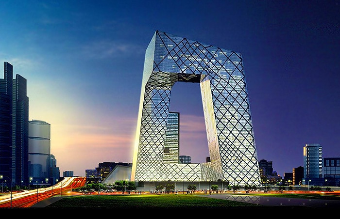 CCTV Building
Apple’s current site isn’t exactly flat. It feels much more immersive and it reminds me of deconstructivism — an absence of harmony, continuity, or symmetry. I can’t find a word beside futuristic to describe this experience. I’m excited to leave flat design behind. I think it’s time, don’t you?
Further Reading
Thanks for reading!